Order Grid
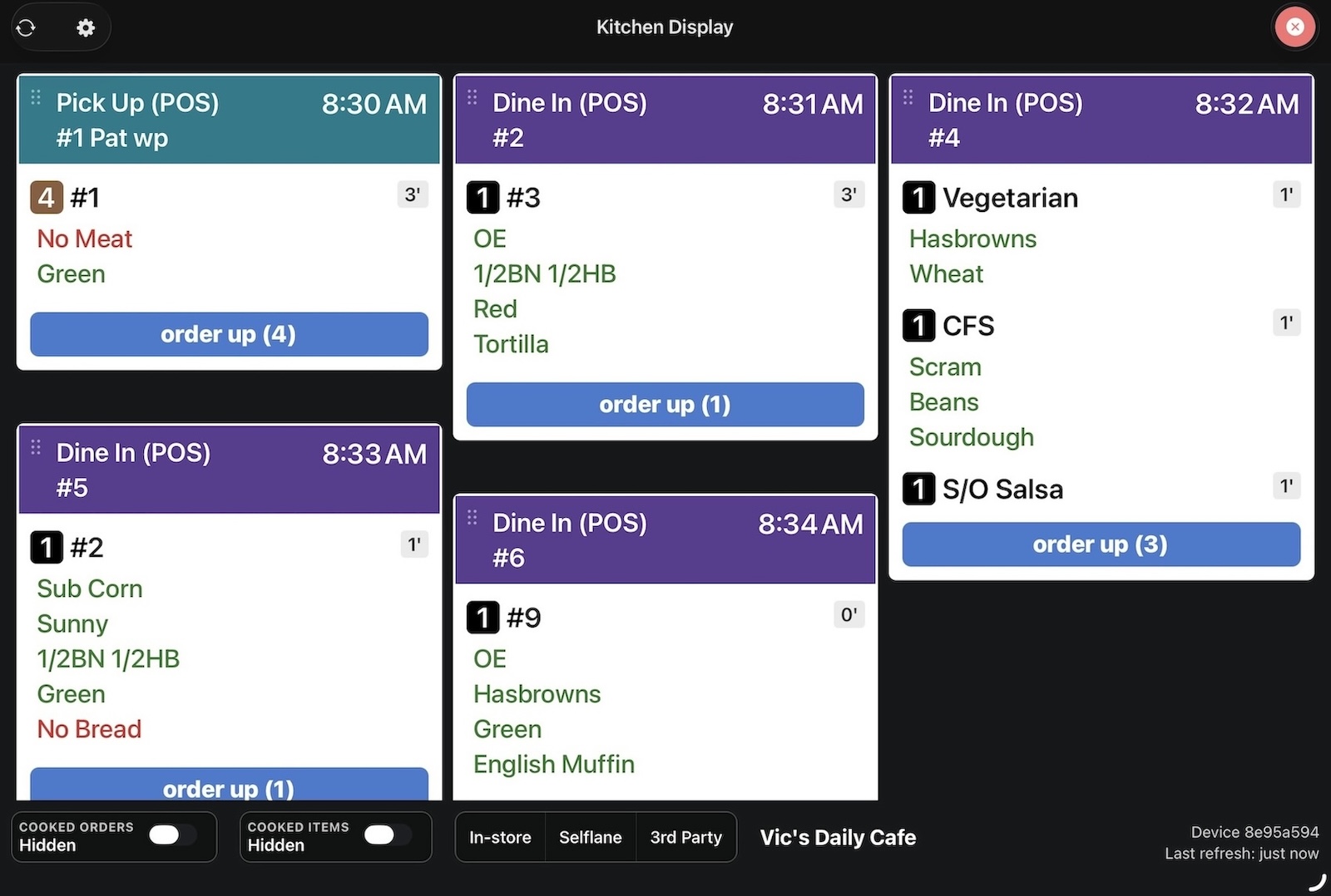
The order grid is the main screen of Selflane Displays. It shows a grid of order cards that update in real time as new orders come in and dishes are marked ready.
Screen Layout
The display is organized into three zones:
- Order grid — the main area showing order cards
- Bottom bar — toggle controls and filters (see Controls & Filtering)
- Bottom-right info — device ID and last refresh time
A loading progress bar appears at the top of the screen during data fetches.
Order Cards
Each order appears as a card with a colored header, a list of dishes, and action buttons.
Header
- Color-coded banner by order type:
- Purple — dine-in
- Teal — pickup
- Green — delivery
- Orange — drive-thru
- Colors are customizable in Settings
- Order type label with platform info (e.g., “Pickup (DoorDash)”)
- Order number, tag, and customer name
- Ready time displayed on the right side
- Status banners appear above the header when applicable:
- Purple “Future” — order is needed more than 60 minutes from now
- Red “Running Late” — order is more than 20 minutes past its needed time
- Order note — displayed below the header if present
Dish List
Each dish row shows:
| Element | Description |
|---|---|
| Quantity badge | Black (qty = 1), brown (qty > 1), blue (ready) |
| Dish name | Kitchen abbreviation or full name. Blue when ready, red background for indicator items |
| Elapsed badge | Time since the dish was created, adjusted for any print hold delay |
| Modifiers | One line per modifier. Green for additions, red for void/no items |
| Notes | Customer name and special instructions shown in green |
Elapsed Time Badges
- Hold N’ (green) — dish is still in its hold period and has not been sent to the kitchen yet
- N’ (gray) — normal elapsed time, under 30 minutes
- N’ (red) — dish has been waiting more than 30 minutes
Marking Dishes as Ready
Order Up (All Dishes)
Tap the Order Up button at the bottom of a card to mark all uncooked dishes as ready. The button shows the total uncooked quantity (e.g., “Order Up (5)”).
To prevent accidental taps, the button enters a confirm step: it turns orange and requires a second tap to submit.
Order Up (Selected Dishes)
- Tap individual dishes to select them (they highlight in blue)
- The button updates to show the selected count (e.g., “Order Up (2 selected)”)
- Tap the button to mark only the selected dishes as ready — no confirmation step needed
Selecting any dish cancels the confirm step if it was active.
Notes on Selection
- Tap a dish to select it, tap again to deselect
- Dishes already marked as ready cannot be selected
- Indicator items (red background) cannot be selected
- When all dishes are ready, the action buttons are hidden
Layout Modes
Vertical Layout (Default)
Displays order cards in a masonry-style grid:
- Configurable 1 to 6 columns
- Adjustable row gap (6-24px)
- Cards expand to fit their content — no scrolling within cards
Best for kitchens with a dedicated large screen where you want to see as many orders as possible at once.
Horizontal Layout
Displays order cards in a horizontally scrollable row:
- Cards stack up to 2 rows per column
- Configurable cell width (200-500px)
- Dish area scrolls within each card, with a “more” indicator when content overflows
Best for narrow or secondary screens, or when you prefer to scroll through orders left to right.
Switch between layouts in Settings.